Paint Colors and Brands We Love and SO Should You!
12.6.25
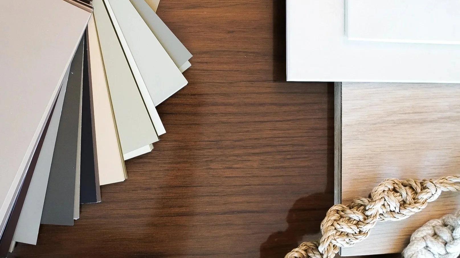
One of the simplest and most budget-friendly ways to refresh a space is with paint! However, with countless shades of white, different sheens for different space needs, and how natural light can completely shift the color (such as how a north-facing wall can look entirely different from an east-facing one!) what seems like a straightforward choice can quickly become overwhelming.
To help, we’ve rounded up some of our favorite paint colors and brands. These include tried-and-true hues from brands we love, as well as exciting new selections we can’t wait to use in upcoming projects.
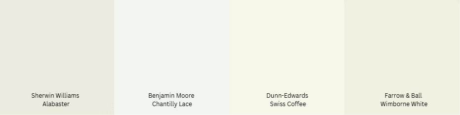
Whites & Off-Whites Timeless, Versatile, and Crisp
Sherwin-Williams - Alabaster (SW 7008) - A warm, soft white that isn’t too stark.
Benjamin Moore - Chantilly Lace (OC-65) - A clean, bright white with no strong undertones.
Dunn-Edwards - Swiss Coffee (DEW341) - A warm, creamy white, perfect for cozy interiors.
Farrow & Ball - Wimborne White (No. 239) - A slightly warm white with a touch of depth.
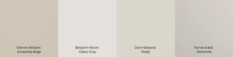
Neutrals & Greiges Warm, Cozy, and Sophisticated
Sherwin-Williams - Accessible Beige (SW 7036) - A perfect mix of beige and gray.
Benjamin Moore - Classic Gray (OC-23) - A soft, warm gray that works in almost any space.
Dunn-Edwards - Shady (DEC774) - A warm greige with a modern, airy feel.
Farrow & Ball - Ammonite (No. 274) - A sophisticated light gray with a subtle warmth.
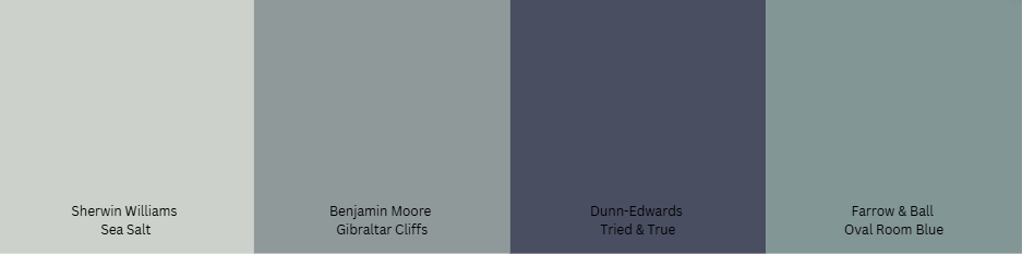
Blues & Greens Calm, Inviting, and Trendy
Sherwin-Williams - Sea Salt (SW 6204) - A muted green with blue undertones, perfect for coastal or spa-like spaces.
Benjamin Moore - Gibraltar Cliffs (1587) - A moody, deep gray-blue with cool undertones.
Dunn-Edwards - Tried and True Blue (DET 582) - A rich classic navy.
Farrow & Ball - Oval Room Blue (No. 85) - A sophisticated, muted blue with subtle green and gray undertones.
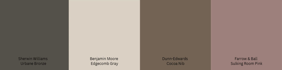
Earthy & Warm Tones Rich, Cozy, and Elegant
Sherwin-Williams - Urbane Bronze (SW 7048) - A deep, warm brown-gray, great for accent walls or cabinetry.
Benjamin Moore - Edgecomb Gray (HC-173) - A warm greige with a soft, earthy feel.
Dunn-Edwards - Cocoa Nib (DET682) - A rich, chocolatey brown that adds warmth and depth.
Farrow & Ball - Sulking Room Pink (No. 295) - A muted, sophisticated blush.
…
Before you grab that paintbrush, here’s one more super important factor to keep in mind, natural light can completely transform how a color looks on your walls. The direction a room faces plays a huge role in this, affecting everything from warmth to depth. I recently moved my workspace at home into a north-facing room and goodness gracious let me tell you how sad I feel if I’m working in there from mid-morning to late afternoon! I definitely can benefit from slathering on a warmer tone in there. Here’s what to expect from each orientation:
North-Facing Walls: Cool & Shadowed
Light: Indirect, cool-toned, and consistent but with soft shadows.
Effect on Paint: Colors tend to look darker, cooler, and sometimes muted.
Best Colors: Warmer tones like creamy whites, warm grays, soft beiges, or warm blues/greens help counteract the cool light.
South-Facing Walls: Bright & Warm
Light: Lots of natural light, warm and golden, especially midday.
Effect on Paint: Colors appear brighter and warmer; soft colors may get washed out.
Best Colors: Mid-tone and deep colors hold up well, while cool-toned colors (like blues and greens) balance the warmth.
East-Facing Walls: Soft & Cool in the Afternoon
Light: Warm and bright in the morning, cooler and dimmer in the afternoon.
Effect on Paint: Warm tones shine in the morning, but in the afternoon, colors may appear muted or cooler.
Best Colors: Soft warm neutrals work well to maintain balance, but if the space is used primarily in the afternoon, consider deeper or warmer colors.
West-Facing Walls: Warm in the Afternoon, Cooler in the Morning
Light: Soft in the morning, very warm, and golden in the afternoon/evening.
Effect on Paint: Afternoon light intensifies warm tones, making reds, oranges, and yellows glow. Cool colors may balance the warmth but could look dull in the morning.
Best Colors: If the room is used most in the afternoon, cooler colors can help tone down the warmth.
The last last tip we’ll leave you with today is to test paint swatches on each wall and look at it throughout the day. Check on it in the morning, afternoon, and evening to see what a difference the sun (or lack thereof) makes to it.
Consider how you use the room, a north-facing bedroom might benefit from a cozy warm neutral, while a west-facing dining room might need a cooler gray to balance the warmth. Play around and have fun! If you don’t like it, paint over it :)
Design with love,
Cat